Purpose

Campaign pages are a single page, full width layout that funnels users through a campaign narrative.

It is designed to educate and motivate an audience to take action, in line with campaign objectives. We do this through simple layouts, with large multimedia and visual elements, supported by clear and direct calls-to-action.

Users are unlikely to read a lot of text, so keep the aim of your campaign short and to the point. You can then use call-to-action links flow the user through to a standard web page to complete a task.

Wheat field at sunset

Layout

A campaign landing page consists of 3 regions.

These are the header region, the menu region, and the content region.

When planned well, these regions work together to grab the reader’s attention and funnel them through the narrative you want to convey.

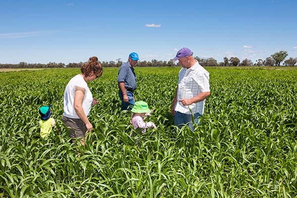
In a field

Header

The header consists of a hero (background) image and logo or slogan.

The hero image should be 1920px x 800px.

There are 2 versions of the header, one with the campaign name as text the other with a logo or graphic.

If using a graphic as text the file should be a transparent PNG and should be no larger than 650px x 305px.

The positioning of the text on the background will be different depending on the device size so it must pass colour contrast wherever it sits on the background.

You can check contrast using a colour contrast tool.

Provide an image to be used when the page is shared, the image should be 1200px x 628px.

A crop of tomatoes

Content

The content region makes up the majority of a campaign landing page. This is where you can lead the reader through your campaign narrative.

This region is constructed in sections that can contain a combination of text and visual components.

Content sections can be either 1, 2 or 3 columns, depending on the type of content. These are:

  • 1 column – full width text or quote block
  • 2 column – text and image, text and video or resources list
  • 3 column – card layout, video card layout or infographics

The background colour of the regions will alternate white and grey (unless specified by the campaign branding).

You can alternate different layouts to reflect the objectives or actions contained in that section, and to keep the reader engaged. For instance, you might use a full width text region to introduce an idea and then use side-by-side text and image sections to extend on that message.

Components

Campaign pages are designed to be rich in visual media and use open layouts to call attention to key information and actions.

Browse the different types of visual components you can include in a campaign landing page.

This advice can help you plan your layouts, including the type and amount of content to include in each section.

Videos

Videos can add richness to a campaign. They can be very effective marketing tools if considered properly.

Use them if they add something to your campaign, and help explain a concept or improve understanding.

Group videos with text that reinforces the same single idea.

Videos should have closed captions enabled and a transcript provided for accessibility.

The video can be in the left or right column of the region. The size of the video is 640px x 360px.

Add max-width:100%; max-height:100%; as an inline style to keep the video responsive.

Videos should be produced and delivered in ways that ensure that all members of the audience can access their content. An accessible video includes captions, a transcript, and if appropriate an audio description and is delivered in an accessible media player.

Brown marmorated stink bug

Images

Images must add to the campaign’s messaging and should be unique to the campaign. Group images with text that reinforces the same single idea.

The image can be in the left or right column of the region.

Images should be around 800px wide so they can be scaled depending on the content in the other column.

You can add parallax to the image to give the page a sense of movement.

Call to action

Cards

Card one

Cards can have a combination of image, title and lead in sentence.

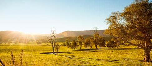
Sunset over field

Card two

The image is 490px x 215px.

Card three

Cards are in groups of 2 or 3.

Infographics are graphic visual representations of information and are intended to present complex information quickly and clearly.

Use an SVG file so the infographic is scalable.

Only present one fact or figure per infographic.

Quote

Aliquam eu nunc. Phasellus dolor. Pellentesque dapibus hendrerit tortor. Donec interdum, metus et hendrerit aliquet, dolor diam sagittis ligula, eget egestas libero turpis vel mi.

Cras risus ipsum, faucibus ut ullamcorper id

Resources

Resources can be added to the campaign landing page or a child page.

Lorem ipsum dolor sit

Download PDF - 8.8 MB

Download Word - 2.8 MB