
These guidelines are for agriculture.gov.au. They provide the base look and feel to be able to create simple user interface elements. It includes styles and components.
Components are the reusable building blocks of our website. Each component meets a specific interaction or UI need, and has been created to work together to create patterns and a better user experience.
Accordion
Accordions help users see only the content they need. Accordions expand and collapse sections of content.
Any heading level can be used as the accordion trigger.
The show/hide controls are automatically applied.
Do not nest accordions in other accordions.
When to use Accordions
We recommend that accordions be used sparingly for primary content on a page. While they can be appropriate for organising small, specific sections of content, accordions are not a suitable replacement for well formatted plain text. If a user requires all, or most of the information on the page it should be visible, not hidden inside an accordion.
Before using an accordion, consider whether the benefits outweigh the negative usability impacts:
Hiding content makes it harder for a user to scan a webpage. If content is hidden inside an accordion it can be difficult for a user to scan a whole web page for content relevant to them. Web browsers' 'Find on page…' search functions do not detect content hidden by accordions, making it harder for users to use their existing tools and behaviours to locate text.
Accordions increase cognitive load. Forcing a user to click on each accordion to receive the full text fragments their user experience, causing them to switch focus between accordions in order to gather all the information. It is also possible that with hidden content, a user might ignore, or not see important information.
Morbi mollis tellus ac sapien. Donec mollis hendrerit risus. Quisque ut nisi. Morbi vestibulum volutpat enim.
Etiam iaculis nunc ac metus. Sed hendrerit. Suspendisse faucibus, nunc et pellentesque egestas, lacus ante convallis tellus, vitae iaculis lacus elit id tortor. Vestibulum turpis sem, aliquet eget, lobortis pellentesque, rutrum eu, nisl.
The show/hide controls are automatically applied, they are not part of the mark up.
<div class="collapsible">
  <h3 aria-expanded="false"><button title="expand section" type="button">Collapsible Item one</button></h3>
  <div>
    <p>Morbi mollis tellus ac sapien. Donec mollis hendrerit risus. Quisque ut nisi. Morbi vestibulum volutpat enim.</p>
    <p>Etiam iaculis nunc ac metus. Sed hendrerit. Suspendisse faucibus, nunc et pellentesque egestas, lacus ante convallis tellus, vitae iaculis lacus elit id tortor. Vestibulum turpis sem, aliquet eget, lobortis pellentesque, rutrum eu, nisl.</p>
  </div>
  ... {repeat collapsible item(s)} ...
</div>
Assisted workflow
The assisted workflow component uses conditional logic to show or hide fields based on user selections, so we can present the most relevant information. It is an embedded webform and has styling to represent a progress indicator to show the user where they are in the process.
Blockquote
The blockquote element is an HTML tag used to define quotations. Only use blockquote to show a quotation. This could be a quote from somewhere else, like a customer testimonial that goes with a case study or project success story.
Blockquote without citation
Lorem ipsum dolor sit amet, consectetur adipiscing elit. Morbi suscipit cursus turpis quis venenatis. Nam viverra, nulla non iaculis tristique, lorem ipsum tempor quam, et lobortis sem ex in ex. Nam faucibus eu augue eget tristique. Maecenas convallis ex ligula, vel porttitor nisl maximus quis.
<blockquote> <p>Lorem ipsum dolor sit amet, consectetur adipiscing elit. Morbi suscipit cursus turpis quis venenatis.</p> </blockquote>
Blockquote with citation
Lorem ipsum dolor sit amet, consectetur adipiscing elit. Morbi suscipit cursus turpis quis venenatis. Nam viverra, nulla non iaculis tristique, lorem ipsum tempor quam, et lobortis sem ex in ex. Nam faucibus eu augue eget tristique. Maecenas convallis ex ligula, vel porttitor nisl maximus quis.
Person's name
Lorem ipsum dolor sit amet, consectetur adipiscing elit. Morbi suscipit cursus turpis quis venenatis. Nam viverra, nulla non iaculis tristique, lorem ipsum tempor quam, et lobortis sem ex in ex.
Lorem ipsum dolor sit amet, consectetur adipiscing faucibus eu augue eget tristique. Maecenas convallis ex ligula, vel porttitor nisl maximus quis.
Lorem ipsum dolor sit amet, consectetur adipiscing elit. Morbi suscipit cursus turpis quis venenatis. Nam viverra, nulla non iaculis tristique, lorem.
Person's name
<blockquote> <p>Lorem ipsum dolor sit amet, consectetur adipiscing elit. Morbi suscipit cursus turpis quis venenatis. Nam viverra, nulla non iaculis tristique, lorem ipsum tempor quam, et lobortis sem ex in ex.</p> <p>Lorem ipsum dolor sit amet, consectetur adipiscing elit. Morbi suscipit cursus turpis quis venenatis. Nam viverra, nulla non iaculis tristique, lorem.</p> <div><cite>Person's name</cite></div> </blockquote>
Buttons
Buttons have an underline on hover in order to address WCAG2.0 Criterion 1.4.1
Callout
Callouts are an excerpt of text or an article that has been pulled out and used as a visual clue to draw the eye to the text. They are used to help direct a user's attention to important pieces of information.
When to use a callout
Use to highlight important content for your users. Callouts are used to:
- draw attention to important pieces of information which the user needs to consider
- link to next steps of a process
- link to a relevant resource
Call out 1
Praesent blandit laoreet nibh. Pellentesque posuere. Phasellus tempus. In dui magna, posuere eget, vestibulum et, tempor auctor, justo. Nullam cursus lacinia erat.
Praesent blandit laoreet nibh. Pellentesque posuere. Phasellus tempus. In dui magna, posuere eget, vestibulum et, tempor auctor, justo. Nullam cursus lacinia erat.
<div class="box-1">
  <h2>H2 Heading</h2>
  <p>Morbi mollis tellus ac sapien. Donec mollis hendrerit risus. Quisque ut nisi. Morbi vestibulum volutpat enim.</p>
</div>
Call out 2
Praesent blandit laoreet nibh. Pellentesque posuere. Phasellus tempus. In dui magna, posuere eget, vestibulum et, tempor auctor, justo. Nullam cursus lacinia erat.
<div class="box-2">
  <h2>H2 Heading</h2>
  <p>Morbi mollis tellus ac sapien. Donec mollis hendrerit risus. Quisque ut nisi. Morbi vestibulum volutpat enim.</p>
</div>
Call out 3
Praesent blandit laoreet nibh. Pellentesque posuere. Phasellus tempus. In dui magna, posuere eget, vestibulum et, tempor auctor, justo. Nullam cursus lacinia erat.
Praesent blandit laoreet nibh. Pellentesque posuere. Phasellus tempus. In dui magna, posuere eget, vestibulum et, tempor auctor, justo. Nullam cursus lacinia erat.
<div class="box-3">
  <h3>H2 Heading</h3>
  <p>Morbi mollis tellus ac sapien. Donec mollis hendrerit risus. Quisque ut nisi. Morbi vestibulum volutpat enim.</p>
</div>
Custom callout box creator
Customise the Callout box example here with the callout box type and box icon options:
Call Out Type 1
Praesent blandit laoreet nibh. Pellentesque posuere. Phasellus tempus. In dui magna, posuere eget, vestibulum et, tempor auctor, justo. Nullam cursus lacinia erat.
- Exclamation
- Info
- Dollar
- Check
- Clock
- Question
- Ban
- Globe
- Comment
- Times (X)
- Calendar Solid
- Arrows Rotate
- ID Card Solid
- Pencil Solid
- Arrow Rotate Left
- No Proceed
Call to action
Link
Call to action links are visually distinct instructions to users designed to provoke an immediate response using verbs such as 'find out more about…'. There are 2 classes to float the link to the left or right (this is a different class to that used on a CTA in a call out box).
<p class="pos-left"><a class="calltoaction" href="#" title="Title">Call to action link</a></p><p class="pos-right"><a class="calltoaction" href="#" title="Title">Call to action link</a></p>Button
Use the call to action button style sparingly, it is generally reserved for the home page but can be used to link to systems or websites where a more obvious visual cue is required. The button text should be kept short as this is more appealing in a button style. Try to use a call to action eg: Login into Micor, rather than a long application name.
<p id="block-have-you-say"><a class="cta" href=#>Call to action button</a></p>Card
The card component is used to provide a brief summary of content or a task, with a link to more detail.
The hit area for the link wraps the entire card.
Cards are used to organise information related to a single topic. Cards can contain multiple elements, such as image, title and text.
Cards on standard pages display in 3 columns.
Any number of cards can be added and no blank card is required.
Title
This is the card pattern at its most basic. This card can be used where no further summary or description is required.
<div class="card-container">
  <div class="card-item">
    <h3 class="cta-link"><a href="# ">Lorem ipsum</a></h3>
  </div>
  ... {repeat card item(s)} ...
</div>
Title and copy
This card has a title and copy. The copy provides further details where the title alone may not be sufficient.
Lorem ipsum
Morbi vestibulum volutpat enim consectetuer adipiscing elit.
Lorem ipsum
Morbi vestibulum volutpat enim consectetuer adipiscing elit.
<div class="card-container">
  <div class="card-item">
    <h3 class="cta-link"><a href="# ">Lorem ipsum</a></h3>
    <p>Morbi vestibulum volutpat enim consectetuer adipiscing elit.</p>
  </div>
  ... {repeat card item(s)} ...
</div>
Image or icon in card
Images or icons can be used to help a user visualise different pieces of information and provide additional context. Images should be jpeg format, 450px x 270px and no larger than 20 KB.
Please provide a 40px margin around icons as the image is cropped slightly.
The image is turned off on mobile.
<div class="card-container">
<div class="card-item">
<drupal-entity data-embed-button="media_entity_embed" data-entity-embed-display="view_mode:media.embed" data-entity-embed-display-settings="" data-entity-type="media" data-entity-uuid="9cd05cb9-0910-452e-b705-93e79c802740" data-langcode="en"></drupal-entity>
<h3 class="cta-link"><a href="# ">Lorem ipsum</a></h3>
<p>Morbi vestibulum volutpat enim consectetuer adipiscing elit.</p>
</div>
</div>
Group landing page card
Images for group landing page cards should be jpeg format, 487px x 212px and no larger than 35 KB. Images crop to a square on tablet and use the central part of the image.
In this section cards In this section cards are used on topic landing pages. They display in 4 columns on desktop.
In this section
- Nam commodo suscipit
- Praesent egestas neque eu
- Donec elit libero
- Mauris turpis nunc blandit et
- Phasellus accumsan cursus velit
- Donec orci lectus
- Morbi mollis tellus ac sapien
- Nunc nec
<ul class="landing-page-links">
  <li><a href="# ">Nam commodo suscipit</a></li>
  <li><a href="# ">Praesent egestas neque eu</a></li>
  <li><a href="# ">Donec elit libero</a></li>
  <li><a href="# ">Mauris turpis nunc blandit et</a></li>
  <li><a href="# ">Phasellus accumsan cursus velit</a></li>
  <li><a href="# ">Donec orci lectus</a></li> <li><a href="# ">Morbi mollis tellus ac sapien</a></li>
  <li><a href="# ">Nunc nec</a></li>
</ul>
When to use Cards
Use card layouts to present a high-level summary of content related to a single topic.
Do:
- consider and choose text and visual elements carefully. Test your cards with the minimal content and only add additional content or graphics where they give needed context to the user
- use headlines that set clear expectations about the content being linked to
- use one style of card per group, don't mix and match
- feature one piece of information per card
- outline the main idea with the minimal possible information, don't overload with information as the card links to more detail
Do not:
- mix card styles within the same group
- overload with information as the card links to more detail
- add inline text links, the card itself is clickable and should link to a single piece of information
When to avoid
Cards should only display enough information to give a user context.
Do not use a card layout:
- to highlight a solo piece of information
- when the content requires in-line or multiple links
- when a large amount of text is needed to give users context
Download
Resource cards are the default display for department produced documents. For any other instances including multiple files and links to external documents use these examples. The best practice for external links is to direct users to a webpage. If linking to a page isn't possible, link to the document instead.
2025-26 Agricultural Exports Cost Recovery Implementation Statements (example 1)
Dairy exports
- Cost recovery implementation statement: Dairy exports (PDF 641 KB)
- Cost recovery implementation statement: Dairy exports (Word 358 KB)
Fish and egg exports
- Cost recovery implementation statement: Fish and egg exports (PDF 641 KB)
- Cost recovery implementation statement: Fish and egg exports (Word 358 KB)
Download locust bulletins (example 2)
2023
2022
Locust bulletins (example 3)
2023
2022
If you have difficulty accessing these files, contact us for help.
<h3>Heading</h3>

 <p><a data-entity-substitution="media" data-entity-type="media" data-entity-uuid="47547a24-c19a-4195-8e59-ac007a44b0a9" href="/media/50093">Locust Bulletin January 2022 (PDF 641 KB)</a>
<br/>
<a data-entity-substitution="media" data-entity-type="media" data-entity-uuid="edd70f02-f432-42bf-84c1-569b47d6834a" href="/media/50094">Locust Bulletin January 2022 (DOCX 1.87 MB)</a></p>
<p>If you have difficulty accessing these files, visit <a data-entity-substitution="canonical" data-entity-type="node" data-entity-uuid="71f06ea8-61ab-4b57-b976-6757020696ee" href="/node/2501">web accessibility</a> for assistance.</p>
Infographics
Infographics are created using the Embed content type.
Infographics can display in a row of 1, 2 or 3 and are centred in the content block.
The infographics can consist of:
- an icon (svg, png or jpeg 300px x 250px)
- text above
- statistic (text)
- text below
Infographics can be embedded anywhere in the body field. Do not restyle the text in the WYSIWYG editor (add heading levels etc).
Images and figures
Users pay close attention to photos and other images that contain relevant information but ignore fluffy pictures used to "jazz up" web pages.
Make sure your images are relevant.
Ask yourself the following questions to help determine if a photo you intend to use is suitable and purposeful:
- Are there any benefits to using this particular image?
- Does it help the user understand the point I’m trying to make?
- How does this image relate to my brand? Does it speak to my target audience?
- What message does this image send? Is there a message being sent at all?
- How will my visitors respond to this image? Will it change their opinion?
Sizes
As a rough guide mages floated in content should be 350px.
Graphs and charts can take up the whole content width (950px).
Images inserted using a media entity
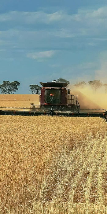
Image with caption
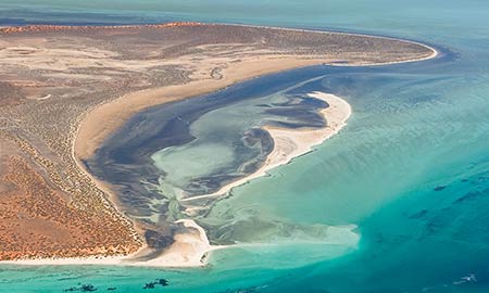
Image floating left
Lorem ipsum dolor sit amet, consectetur adipiscing elit, sed do eiusmod tempor incididunt ut labore et dolore magna aliqua. Ut enim ad minim veniam, quis nostrud exercitation ullamco laboris nisi ut aliquip ex ea commodo consequat. Duis aute irure dolor in reprehenderit in voluptate velit esse cillum dolore eu fugiat nulla pariatur. Excepteur sint occaecat cupidatat non proident, sunt in culpa qui officia deserunt mollit anim id est laborum.
Image floating right
Lorem ipsum dolor sit amet, consectetur adipiscing elit, sed do eiusmod tempor incididunt ut labore et dolore magna aliqua. Ut enim ad minim veniam, quis nostrud exercitation ullamco laboris nisi ut aliquip ex ea commodo consequat. Duis aute irure dolor in reprehenderit in voluptate velit esse cillum dolore eu fugiat nulla pariatur. Excepteur sint occaecat cupidatat non proident, sunt in culpa qui officia deserunt mollit anim id est laborum.
Images linked to source file
If an image is not added as a media entity please add a class"photo floatleft" or photo floatright".
Figure caption
If the figure caption needs formatting add it to the page do not use the Caption field when embedding the image.
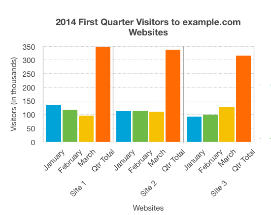
Figure 5: Suspendisse feugiat. Aenean vulputate eleifend. Vestibulum dapibus nunc augue. Aliquam erat volutpat. Fusce convallis metus.
Icon list
Use icons as visual cues. Create an unordered list and choose the icon from the Styles menu in the WYSIWYG editor.
- Exclamation
- Info
- Dollar
- Check
- Clock
- Question
- Ban
- Globe
- Comment
- Times (X)
- Calendar Solid
- Arrows Rotate
- ID Card Solid
- Pencil Solid
- Arrow Rotate Left
- No Proceed
List
A list organises information into discrete sequential sections.
When to use a list
Use unordered lists to display text in no specific order.
Use an ordered list when you need to display text in some ranking, hierarchy, or series of steps.
Unordered lists
- List item one
- List item two with nested list
- Nested list item one
- Nested list item two with nested list
- Nested list item one
- Nested list item two
- Nested list item three
- Nested list item three
- List item three
Ordered lists
Nesting ordered lists
- List item one
- List item two with nested list
- Nested list item one
- Nested list item two with nested list
- Nested list item one
- Nested list item two
- Nested list item three
- Nested list item three
- List item three
Nesting ordered lists with alpha and roman listing types
- Vehicula ipsum a arcu cursus. Aliquet bibendum enim facilisis gravida neque convallis a cras
- vehicula ipsum a arcu cursus aliquet bibendum enim facilisis gravida neque convallis a cras
- vehicula ipsum a arcu cursus aliquet bibendum:
- facilisis gravida neque convallis a cras; or
- tempus imperdiet nulla malesuada;
- vehicula ipsum a arcu cursus aliquet bibendum enim facilisis gravida neque convallis a cras
- ultrices mi tempus imperdiet nulla malesuada pellentesque elit
- bibendum enim facilisis gravida neque convallis a cras
- vehicula ipsum a arcu cursus aliquet bibendum enim facilisis gravida neque convallis a cras
- tempor orci eu lobortis elementum nibh tellus.
Mixed lists
- List item one
- List item two with nested list
- Nested list item one
- Nested list item two with nested list
- Nested list item one
- Nested list item two
- Nested list item three
- Nested list item one
- Nested list item two with nested list
- Nested list item three
- Nested list item three
- List item three
Listing layout
The listing layout displays a compact list of multiple related items like articles or events.
Each item includes a title, a small image, descriptive text, and a link/s.
When to use the listing layout
Use the listing layout when you want to highlight information like articles, events, or documents that appear elsewhere on our website or from other sources.

Lorem ipsum dolor
Morbi vestibulum volutpat enim consectetuer adipiscing elit. Integer eget aliquet nibh praesent tristique magna sit amet.
Vehicula ipsum a arcu cursus. Aliquet bibendum enim facilisis gravida neque convallis a cras.
<div class="flex-media">
<div class="flex-media-figure">
{drupal-entity (image)}
</div>
<div class="flex-media-content">
<h3>Lorem ipsum dolor</h3>
<p>Morbi vestibulum volutpat enim consectetuer adipiscing elit. Integer eget aliquet nibh praesent tristique magna sit amet.</p> <p>Vehicula ipsum a arcu cursus. Aliquet bibendum enim facilisis gravida neque convallis a cras.</p>
<ul>
<li><a href="#">Phasellus ullamcorper ipsum</a></li>
... {repeat list item(s)} ...
</ul>
</div>
</div>
Megamenu feature card
The megamenu feature cards sit on the right hand side of the megamenu.
Use the megamenu feature card to:
- promote the latest or most popular content
- communicate and drive users to a specific call to action
When to use the megamenu feature card
Contact your strategic communications account manager for guidance on how to use the megamenu feature card to promote your content.
Feature card image specifications
Images must be jpeg format, 315px x 130px and no larger than approximately 50 KB.
The image is turned off on mobile.
News and media centre images
Images should be 1000px wide by 667px high (try to keep them under 200KB if possible).
Image naming convention:
- mediacentre-topic-image-description, eg: mediacentre-cewo-waterway.jpg
Rather than name the image specific to the news item or case study for example, keep the description generic so that it can be found easily and reused.
Resource Card
Resource cards are a useful tool for presenting a discrete piece of content within a page (e.g. a short case study or context for a resource such as a document download), rather than forcing the user to click to other pages for that information.
Resource cards are a card style where the whole card is not linked. Instead, it contains HTML content that may include a link or links.
A single document can be displayed within a resource card, and multiple file types (e.g., Word and PDF) can be included. If you need to include more than one file, consider using the two-column resource card layout. For cases that involve a large number of files, refer to the Download section. Use a hyperlink for any links to external documents, these should not be placed within a resource card.
On mobile images are disabled.
Note: when using links like 'Download PDF' or 'Download Word' etc, please add the full document name to the aria-label attribute of the link. E.g. aria-label="Full file name". This will provide screen readers with more information about the link.
One Column
Resource Card Heading [H3]
This resource card has no image.
Integer posuere erat a ante venenatis dapibus posuere velit aliquet. Donec ullamcorper nulla non metus auctor fringilla. Nullam quis risus eget urna mollis ornare vel eu leo.
Resource Card Heading [H3]
This resource card has no image.
Integer posuere erat a ante venenatis dapibus posuere velit aliquet. Donec ullamcorper nulla non metus auctor fringilla. Nullam quis risus eget urna mollis ornare vel eu leo.
If you have difficulty accessing these files, contact us for help.
Resource Card Heading [H3]
This resource card has a 'teaser' type image. The teaser image should be max 170px wide.
Integer posuere erat a ante venenatis dapibus posuere velit aliquet. Donec ullamcorper nulla non metus auctor fringilla. Nullam quis risus eget urna mollis ornare vel eu leo.
If you have difficulty accessing these files, contact us for help.
Resource Card Heading [H3]
This resource card has a 'poster' type image. The height of the image should be twice the width, eg: 500px x 1000px. The standard card image size can also be used here (450px x 270px) but the image will crop to approximately 170px wide using the centre as the focal point.
Integer posuere erat a ante venenatis dapibus posuere velit aliquet. Donec ullamcorper nulla non metus auctor fringilla. Nullam quis risus eget urna mollis ornare vel eu leo.
Resource Card Heading [H3]
This resource card has an 'infographic' type image. Infographics for resource cards are SVG files embedded into the HTML.
Integer posuere erat a ante venenatis dapibus posuere velit aliquet. Donec ullamcorper nulla non metus auctor fringilla. Nullam quis risus eget urna mollis ornare vel eu leo.
If you have difficulty accessing these files, contact us for help.
  <div class="resource-cards">
    <div class="card-item">
      <div class="card-item-body">
        <div>
          <h3>Resource Card Heading [H3]</h3>
          <p>Resource card has no image.</p>
        </div>
        <div>
          <a class="calltoaction" href="/">Call-to-action</a>
        </div>
      </div>
    </div>

    <div class="card-item">
      <div class="card-item-image-teaser">
        <img alt="Image alt text" loading="lazy" src="/path/to/image" />
      </div>
      <div class="card-item-body">
        <div>
          <h3>Resource Card Heading [H3]</h3>
          <p>This resource card has a 'teaser' type image.</p>
        </div>
        <div>
          <div class="downloads">
            <ul>
              <li><a download="" aria-label="Full file name" href="/path/to/file">File name - [file size in kilobytes] KB</a></li>
              ... other files ...
            </ul>
          </div>
        </div>
      </div>
    </div>

    <div class="card-item">
      <div class="card-item-image-poster">
        <img alt="Image alt text" loading="lazy" src="/path/to/image" />
      </div>
      <div class="card-item-body">
        <div>
          <h3>Resource Card Heading [H3]</h3>
          <p>This resource card has a 'poster' type image.</p>
        </div>
        <div>
          <a class="calltoaction" href="/">Call-to-action</a>
        </div>
      </div>
    </div>

    <div class="card-item">
      <div class="card-item-image-infographic">
        [SVG embedded]
      </div>
      <div class="card-item-body">
        <div>
          <h3>Resource Card Heading [H3]</h3>
          <p>This resource card has an 'infographic' type image.</p>
        </div>
        <div>
          <div class="downloads">
            <ul>
              <li><a download="" aria-label="Full file name" href="/path/to/file">File name - [file size in kilobytes] KB</a></li>
              ... other files ...
            </ul>
          </div>
        </div>
      </div>
    </div>

  </div>
Two Columns
Resource Card Heading [H3]
This resource card has no image.
Integer posuere erat a ante venenatis dapibus posuere velit aliquet. Donec ullamcorper nulla non metus auctor fringilla. Nullam quis risus eget urna mollis ornare vel eu leo.

Resource Card Heading [H3]
This resource card has a 'teaser' type image. Images should have a maximum width of 170px.
Integer posuere erat a ante venenatis dapibus posuere velit aliquet. Donec ullamcorper nulla non metus auctor fringilla. Nullam quis risus eget urna mollis ornare vel eu leo.
If you have difficulty accessing these files, contact us for help.
Resource Card Heading [H3]
This resource card has a 'poster' type image. Images use the standard card image size, 450px x 270px and no larger than 20 KB.
Integer posuere erat a ante venenatis dapibus posuere velit aliquet. Donec ullamcorper nulla non metus auctor fringilla. Nullam quis risus eget urna mollis ornare vel eu leo.
Resource Card Heading [H3]
This resource card has an 'infographic' type image. Infographics for resource cards are SVG files embedded into the HTML.
Integer posuere erat a ante venenatis dapibus posuere velit aliquet. Donec ullamcorper nulla non metus auctor fringilla. Nullam quis risus eget urna mollis ornare vel eu leo.
If you have difficulty accessing these files, contact us for help.
  <div class="resource-cards col-2">
    <div class="card-item">
      <div class="card-item-body">
        <div>
          <h3>Resource Card Heading [H3]</h3>
          <p>Resource card has no image.</p>
        </div>
        <div>
          <a class="calltoaction" href="/">Call-to-action</a>
        </div>
      </div>
    </div>

    <div class="card-item">
      <div class="card-item-image-teaser">
        <img alt="Image alt text" loading="lazy" src="/path/to/image" />
      </div>
      <div class="card-item-body">
        <div>
          <h3>Resource Card Heading [H3]</h3>
          <p>This resource card has a 'teaser' type image.</p>
        </div>
        <div>
          <div class="downloads">
            <ul>
              <li><a download="" aria-label="Full file name" href="/path/to/file">File name - [file size in kilobytes] KB</a></li>
              ... other files ...
            </ul>
          </div>
        </div>
      </div>
    </div>

    <div class="card-item">
      <div class="card-item-image-poster">
        <img alt="Image alt text" loading="lazy" src="/path/to/image" />
      </div>
      <div class="card-item-body">
        <div>
          <h3>Resource Card Heading [H3]</h3>
          <p>This resource card has a 'poster' type image.</p>
        </div>
        <div>
          <a class="calltoaction" href="/">Call-to-action</a>
        </div>
      </div>
    </div>

    <div class="card-item">
      <div class="card-item-image-infographic">
        [SVG embedded]
      </div>
      <div class="card-item-body">
        <div>
          <h3>Resource Card Heading [H3]</h3>
          <p>This resource card has an 'infographic' type image.</p>
        </div>
        <div>
          <div class="downloads">
            <ul>
              <li><a download="" aria-label="Full file name" href="/path/to/file">File name - [file size in kilobytes] KB</a></li>
              ... other files ...
            </ul>
          </div>
        </div>
      </div>
    </div>

  </div>
Step-by-step
The step-by-step component allows users to quickly understand what is involved in completing a process, with further information available to assist with completion.
Content is presented in accordions with specific styles for callout boxes, these are:
- Information callout box
- Success callout box
- Warning callout box
- Error callout box
Step-by-step callout box
Customise the step-by-step callout box example here with the feedback box type and feedback box icon options:
Step-by-step callout box
Fusce dapibus, tellus ac cursus commodo, tortor mauris condimentum nibh, ut fermentum massa justo sit amet risus. Aenean eu leo quam. Pellentesque ornare sem lacinia quam venenatis vestibulum. Donec id elit non mi porta gravida at eget metus. Sed posuere consectetur est at lobortis. Morbi leo risus, porta ac consectetur ac, vestibulum at eros.
- Exclamation
- Info
- Dollar
- Check
- Clock
- Question
- Ban
- Globe
- Comment
- Times (X)
- Calendar Solid
- Arrows Rotate
- ID Card Solid
- Pencil Solid
- Arrow Rotate Left
- No Proceed
Timeline
The timeline component displays a list of events in chronological order.
A timeline is created using the Embed content type.
A timeline can have any combination of:
- a date
- a title
- a summary.
Horizontal timelines should have no more than 5 time points. Vertical timelines can have more time points, but keep it sensible for the reader.
Timelines can be embedded anywhere in the body field.
Tables
Data tables are used to organize data with a logical relationship in grids. Accessible tables need HTML markup that indicates header cells and data cells and defines their relationship.
By default, the tables scroll horizontally at smaller breakpoints.
When to use tables
Use tables for data sets that share common attributes.
Use tables to logically structure content and make it easier to scan, sort and compare.
Table contents are left aligned to facilitate easy scanning.
Right align numerical data for easier scanning and comparison.
Use a caption to describe the table's contents. The caption is displayed at the top of the table. A summary is usually only needed for complex tables.
If both caption and summary are provided for one table, the summary should not duplicate information present in the caption.
For more information on table formats see the Tables concepts tutorial.
Basic Table
| Heading 1 | Heading 2 | Heading 3 |
|---|---|---|
| Cell A1 | Cell A2 | Cell A3 |
| Cell B1 | Cell B2 | Cell B3 |
Regular Table
| Heading 1 | Heading 2 | Heading 3 | Heading 4 | Heading 5 |
|---|---|---|---|---|
| Cell A1 | Cell A2 | Cell A3 | Cell A4 | Cell A5 |
| Cell B1 | Cell B2 | Cell B3 | Cell B4 | Cell B5 |
| Cell C1 | Cell C2 | Cell C3 | Cell C4 | Cell C5 |
| Cell D1 | Cell D2 | Cell D3 | Cell D4 | Cell D5 |
Complex table
| Charge Type | Unit of Charge | Type of Charge | Legislated Rate | Remission Rate | Resultant Charge |
|---|---|---|---|---|---|
| Throughput levies | |||||
| Tier 1 – Throughput – Full Unit | Animal | Levy | $0.70 | $0.35 | $0.35 |
| Tier 1 Throughput – Sheep/Goat/Lamb | Animal | Levy | $0.18 | $0.09 | $0.09 |
| Tier 1 Throughput – Deer/Game Deer | Animal | Levy | $0.14 | $0.07 | $0.07 |
| Tier 1 Throughput – Calf | Animal | Levy | $0.07 | $0.03 | $0.04 |
| Tier 1 Throughput – Kangaroo/Wild Boar | Animal | Levy | $0.05 | $0.02 | $0.03 |
Typography
Primary font
Our primary typeface is Open Sans. It is optimised for web and mobile interfaces, and has excellent legibility characteristics in its letterforms.
Headings
Headings are used to create a clear visual hierarchy, to facilitate finding information on the page. There are different standard sizes for the headings for large screens and small screens. H2 and H5 can use a colour from one of the colour palettes.
Write all headings in sentence case. Mark up headings semantically (do not skip heading levels) using the appropriate level HTML element.
Heading styles are set in the CSS do not change the style of headings by making them bold or italic. Do not link hedings if possible.
Heading 2
Heading 3
Heading 4
Heading 5
Heading 6
Heading 2
Praesent blandit laoreet nibh. Pellentesque posuere. Phasellus tempus. In dui magna, posuere eget, vestibulum et, tempor auctor, justo. Nullam cursus lacinia erat. Suspendisse feugiat. Praesent adipiscing. Suspendisse potenti.
Heading 3
Praesent blandit laoreet nibh. Pellentesque posuere. Phasellus tempus. In dui magna, posuere eget, vestibulum et, tempor auctor, justo. Nullam cursus lacinia erat. Suspendisse feugiat. Praesent adipiscing. Suspendisse potenti.
Heading 4
Praesent blandit laoreet nibh. Pellentesque posuere. Phasellus tempus. In dui magna, posuere eget, vestibulum et, tempor auctor, justo. Nullam cursus lacinia erat. Suspendisse feugiat. Praesent adipiscing. Suspendisse potenti.
Heading 5
Praesent blandit laoreet nibh. Pellentesque posuere. Phasellus tempus. In dui magna, posuere eget, vestibulum et, tempor auctor, justo. Nullam cursus lacinia erat. Suspendisse feugiat. Praesent adipiscing. Suspendisse potenti.
Heading 6
Praesent blandit laoreet nibh. Pellentesque posuere. Phasellus tempus. In dui magna, posuere eget, vestibulum et, tempor auctor, justo. Nullam cursus lacinia erat. Suspendisse feugiat. Praesent adipiscing. Suspendisse potenti.
Links
Links in text are blue and underlined by default. If your link is at the end of a sentence or paragraph, make sure that the linked text does not include the full stop.
Do not italicise links.
Links in text
Tempor auctor, justo. Nullam cursus lacinia erat Abares Standard Page laoreet nibh. Pellentesque posuere. Phasellus tempus. In dui magna, posuere eget, vestibulum suspendisse feugiat. Praesent adipiscing. Home page. Link to an external page (target="_blank"): Emissions Reduction Fund.
Document Links
- File.docx
- File.doc
- File.pptx
- File.ppt
- File.xls
- File.xlsx
- File.xltx
- File.csv
- File.pdf
- File.jpg
- File.jpeg
- File.png
- File.gif
- File.tif
- File.tiff
- File.mp3
- File.zip
On this page
On this page (or page contents as it is sometimes called) is placed above main content of a page and provides navigation to individual anchor links located in the main content.
Include in the HTML to have the JS dynamically generate a TOC based on H2 headings in the page.
<div id="tocDiv"></div>To exclude an H2 from the list use data-toc="ignore" in the H2 tag.
Right box white background
If you would like to add a logo to the sidebar, the first box (and only the first box) can be overridden and a white background applied.
Check the box: Right box 0 full width and white background?
This is only to be used for a logo or a small image.
Slideshow
Homepage
The slideshow captures a user's attention and is placed at the top of our homepage.
Use the slideshow to:
- promote the latest or most popular content
- communicate and drive users to a specific call to action
When to use the slideshow
Slideshows are only used on the homepage, they highlight the primary task or piece of information, and allow the user to take quick action.
Contact your strategic communications account manager for guidance on how to use the slideshow to promote your content.
Slideshow specifications
Images must be in jpeg format, 1920px x 515px and no larger than approximately 200 KB.
Do not include any text on the image. The left side of the image is obscured by the text box please ensure the important part of the image is on the right.
The image is turned off on mobile.
The body of the slideshow consists of a title (H2), lead in sentence and call to action (add class="cta" to the link).
Create a new slide on the homepage
Edit the slideshow by selecting the edit icon in the top right of the slideshow.
Select Add Slider or edit an existing slide.
Add the image.
Add the H2, lead in sentence and call to action (add class="cta" to the link) from the Excel template provided, in the body field.
Save the view.
ABARES homepage
The slideshow captures a user's attention and is placed at the top of the content area on the ABARES homepage.
Use the slideshow to:
- promote the latest or most popular content
- communicate and drive users to a specific call to action
When to use the slideshow
Slideshows are only used on the ABARES homepage, they highlight the primary task or piece of information, and allow the user to take quick action.
Contact your strategic communications account manager for guidance on how to use the slideshow to promote your content.
Slideshow specifications
Images must be in jpeg format, 955px x 525px and no larger than approximately 150 KB.
Do not include any text on the image. The left side of the image is obscured by the text box please ensure the important part of the image is on the right.
The image is turned off on mobile.
Create a new slide
The ABARES slideshow is marked up on the node.
Video embed
Videos should be produced and delivered in ways that ensure that all members of the audience can access their content. An accessible video includes captions, a transcript, and if appropriate an audio description and is delivered in an accessible media player.
Add style=”max-width:100%; max-height:100%;” to the iframe to make the video responsive.
If the video is not fullwidth, add style=”max-width:XXpx;" to the accordion div (where XXpx is the width of the video) to make the width match the size of the video.
Viostream
Morbi mollis tellus ac sapien. Donec mollis hendrerit risus. Quisque ut nisi. Morbi vestibulum volutpat enim.
Etiam iaculis nunc ac metus. Sed hendrerit. Suspendisse faucibus, nunc et pellentesque egestas, lacus ante convallis tellus, vitae iaculis lacus elit id tortor. Vestibulum turpis sem, aliquet eget, lobortis pellentesque, rutrum eu, nisl.
<p><iframe allowfullscreen="" mozallowfullscreen="" src="https://publish.viostream.com/player/iframe/bgoo5gydjn59om" style="width:640px; height:360px; border:none; overflow: hidden; max-width:100%; max-height:100%;" webkitallowfullscreen=""></iframe></p>
Youtube
Morbi mollis tellus ac sapien. Donec mollis hendrerit risus. Quisque ut nisi. Morbi vestibulum volutpat enim.
Etiam iaculis nunc ac metus. Sed hendrerit. Suspendisse faucibus, nunc et pellentesque egestas, lacus ante convallis tellus, vitae iaculis lacus elit id tortor. Vestibulum turpis sem, aliquet eget, lobortis pellentesque, rutrum eu, nisl.
<p><iframe height="359" src="https://www.youtube.com/embed/-r_kpZ4wizU" style="max-width:100%;max-height:100%" width="640"></iframe></p>